|
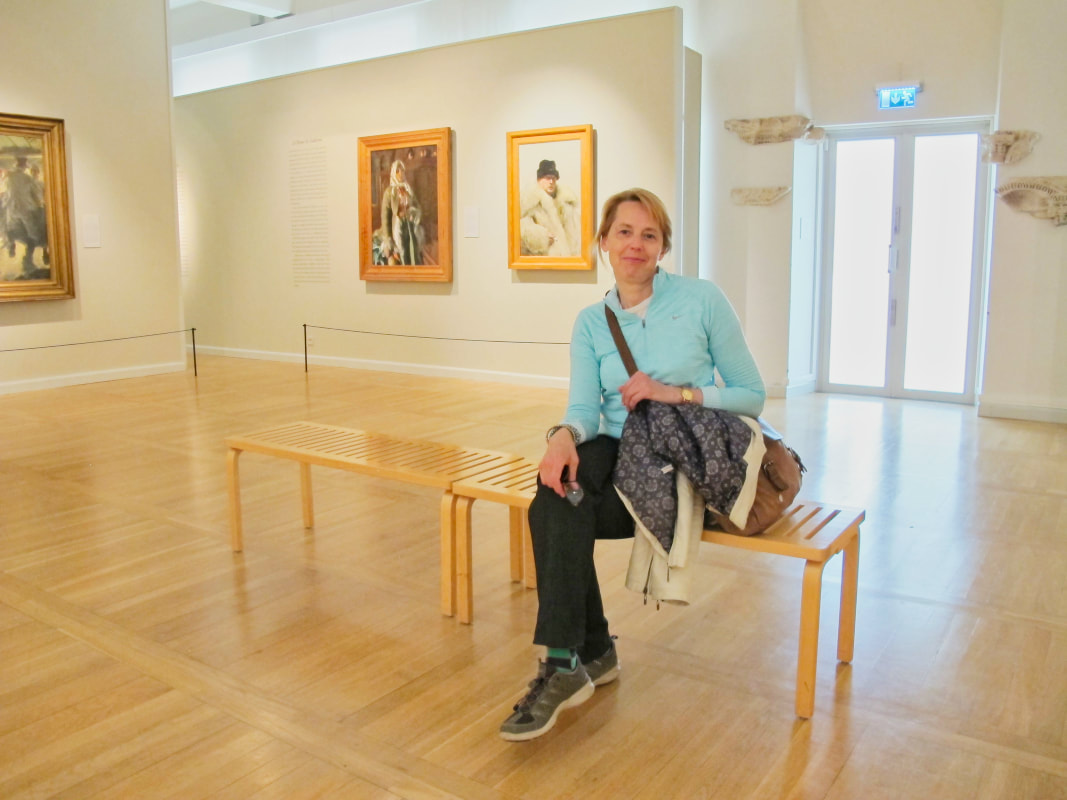
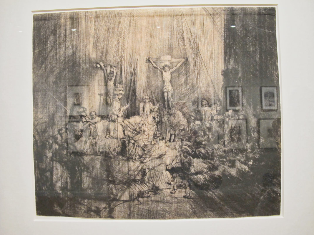
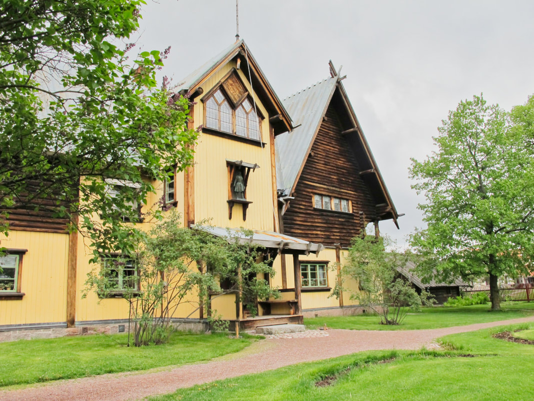
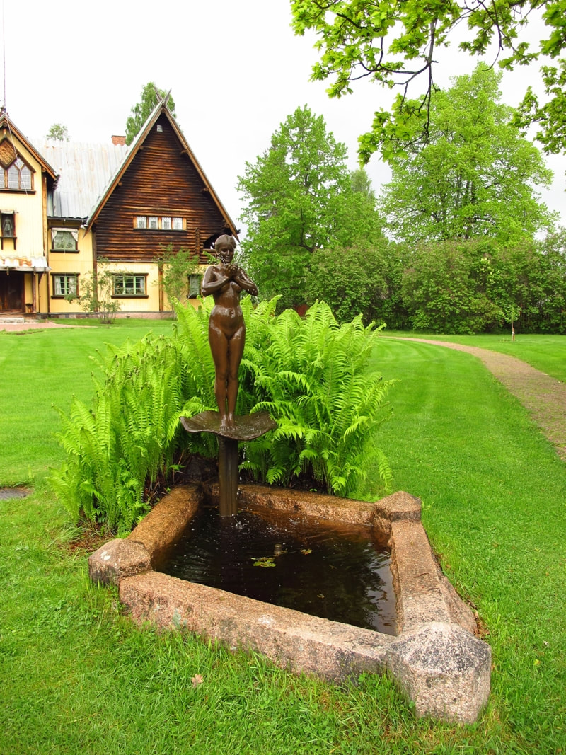
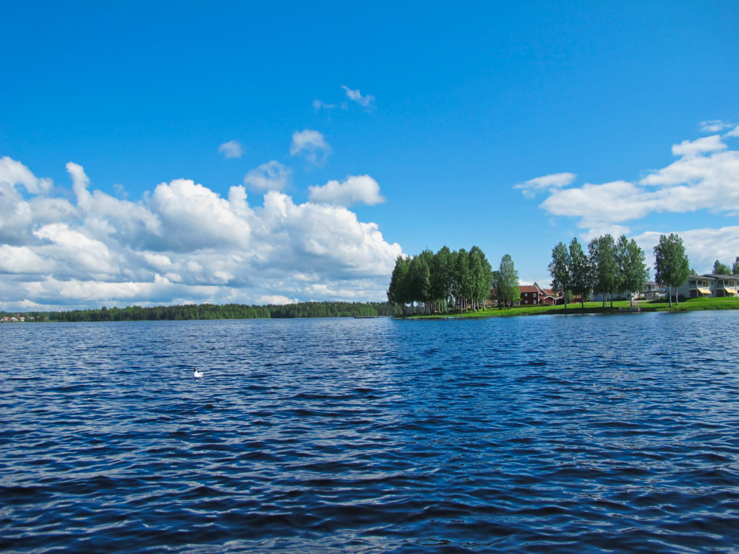
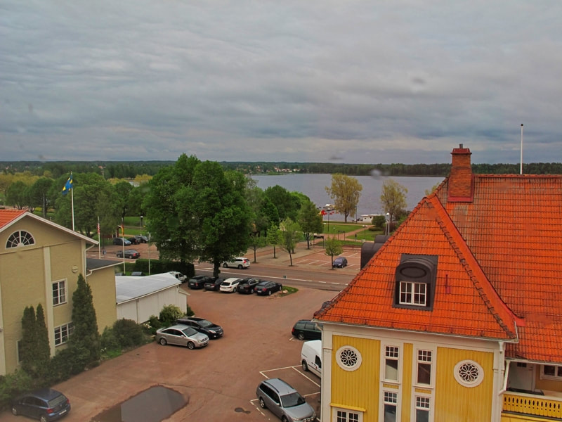
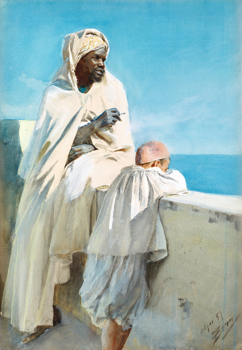
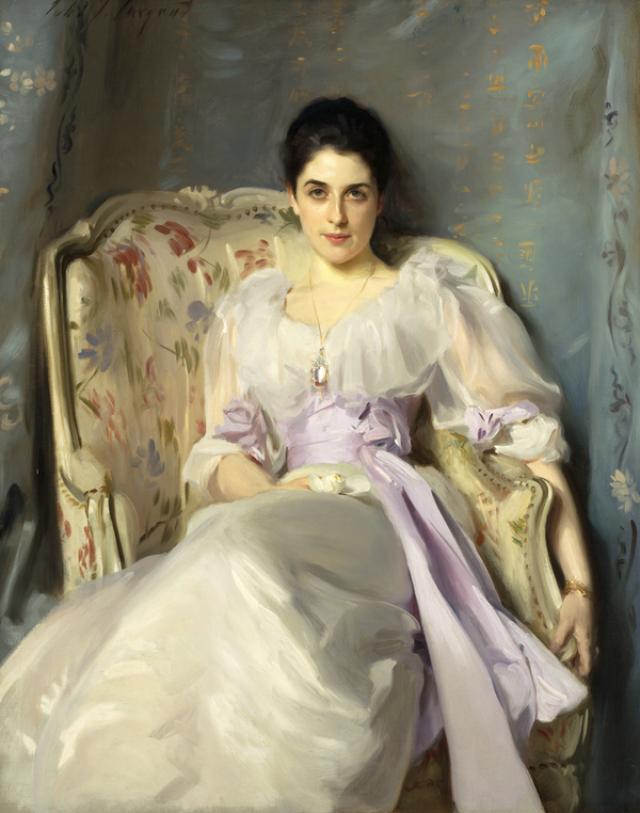
The choice was - gallery or ride in nature on Good Friday. It was going to be sunny. So I chose a ride in nature. These days I most often choose not to go to a gallery and instead be outdoors. Cycling through the incredible twisted beauty of budding oak groves. And the huge grey herons putting their nests together up high in the pine trees of Djurgården. But another reason I didn't choose a gallery is because a lot of shows in Stockholm I find a bit uninspiring. Or boring to be not-so-polite.. At the premier modern art gallery, Moderna Museet, they tend to have shows of ‘cool’ artists. You know, like Andy Warhol. Artists with a clear cut 'concept'. Minimalists. Ironists. That sort of thing. I like to see PAINT. Used abundantly and non ironically. With sensitivity. Though, earlier this year, at the newly furbished National Gallery of Stockholm, an exhibition of the 19th century portrait painter, John Singer Sargent (US 1856-1925) was held. You think I would've been happy then. I’ve never seen his paintings in reality. And he’s a great technical painter. So I thought I might learn something. They look beautiful in the books anyway, so I should go, I thought. But I didn’t end up going. Why? Because in the end I find many portraits, no matter how perfectly they’re painted, pretty superficial. They are not about the inner life of the person – which is really the only thing that interests me. They’re about which peg they’re on in the particular social hierarchy they belong to. And the brilliant technique and design capabilities of the artist. Amongst other things. Not Rembrandt though. (Though this is a bit unfair to JSS.) 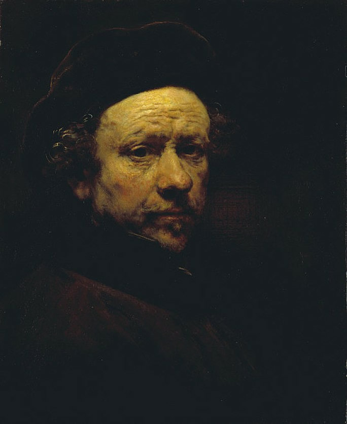 Masters John Singer Sargent is a painter that’s constantly referenced on the internet as being a master. Along with his contemporary, Anders Zorn (1860-1920) – who’s swedish and probably Sweden’s most famous painter. Zorn’s the same for me. A bit superficial. He had fantastic technique like Singer Sargent but... Home Visit We actually visited his home and gallery in Mora, north of Stockholm, a few years ago. It’s well worth visiting. His house, studio and garden he designed and built with his wife Emma. And it is little changed. The museum has the latest tech in it though. After visiting his home you get a sense of Zorn as someone who created a kind of celebrity persona for the public, but his real personality was quite down to earth and private. His paintings accurately reflect the colour and light of Sweden most of the year. Muted and minimal. But I loved his Italian paintings - some of which are on display in the museum - which are full of colour. And blue makes an appearance. Here’s one of his watercolours (below left) before he started painting in a big way. I couldn’t live without blue.
Zorn's portrait palette
I recently decided to use Zorn’s palette of painting a portrait. And there’s no blue in it. It’s only 4 colours. Really two. Titanium white, ivory black, vermillion and yellow ochre. Interestingly, when using black, you get these shadow tones that create the illusion of a kind of blue. His colour palette makes painting a portrait easier. As the colour is so unified. I will definitely be using it again. And this palette creates a lovely balance of warm and cool tones. It’s all in the tone.
0 Comments
Leave a Reply. |

 RSS Feed
